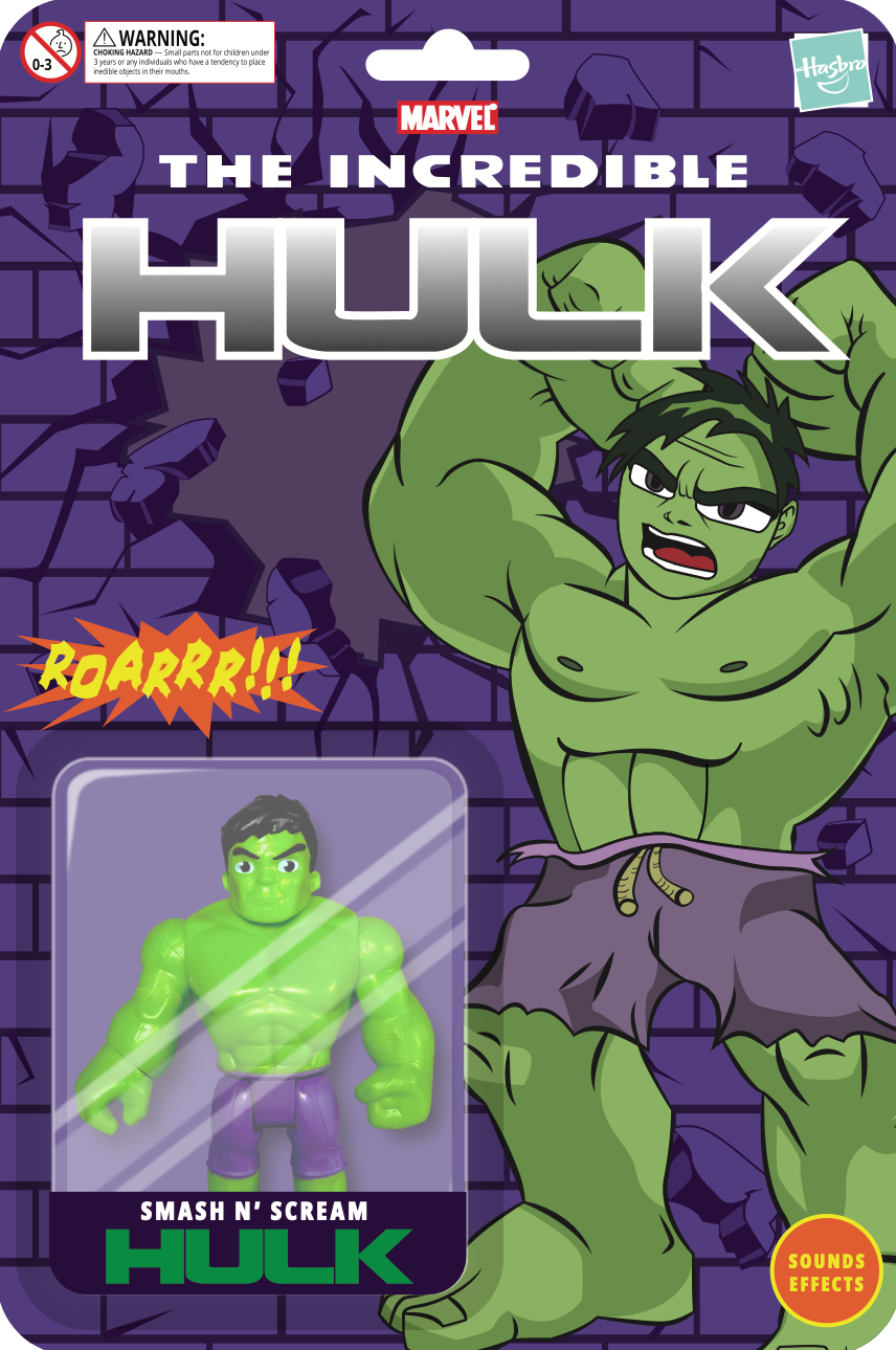
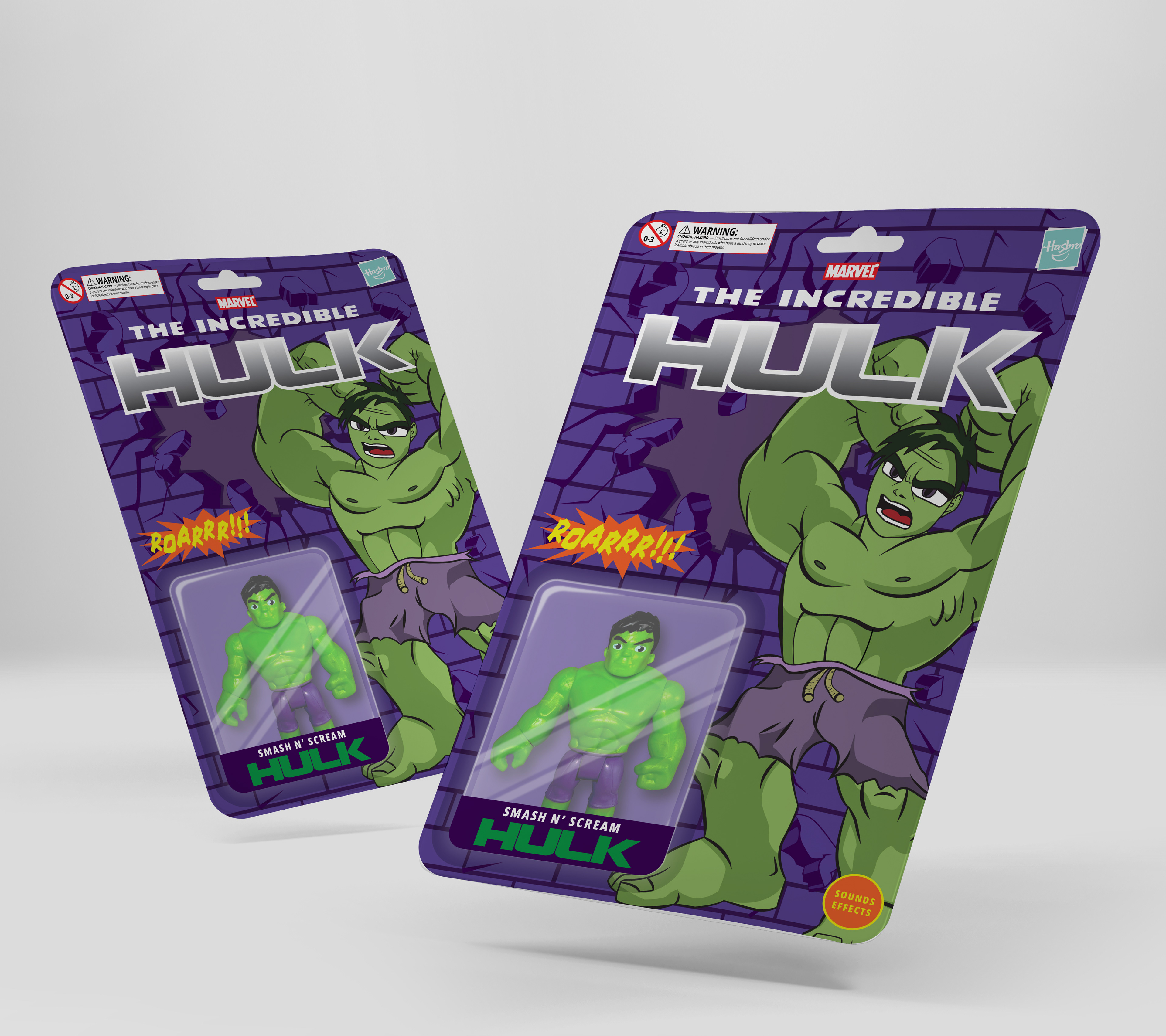
The goal was to redesign the blister card packaging for a Hulk toy in a way that feels more dynamic, visually impactful, and accessible to a broader audience; not only children, but also parents and collectors.
I began by analyzing traditional toy blister packaging, identifying opportunities to amplify contrast, hierarchy, and the enhance shelf presence, improve readability, and create a packaging experience that visually communicates the character’s strength and energy before the product is even opened.

The character’s name was designed large, bold, and highly readable from a distance, reinforcing brand recognition.
I also considered the transparency of the blister window as part of the composition, ensuring the physical toy integrated visually with the illustrated background. The final result combines illustration, colour psychology, and layout structure to create packaging that feels energetic, cohesive, and retail-ready.