The goal was to design a four-page illustrated magazine spread that serves as an engaging and visually immersive travel guide to Guatapé, Colombia. The goal was to make the content informative yet entertaining; easy to read, visually dynamic, and accessible.

The project began with research into Guatapé’s identity. From there, I developed a layout that balanced illustration and editorial structure, ensuring the magazine felt lively without overwhelming the reader.
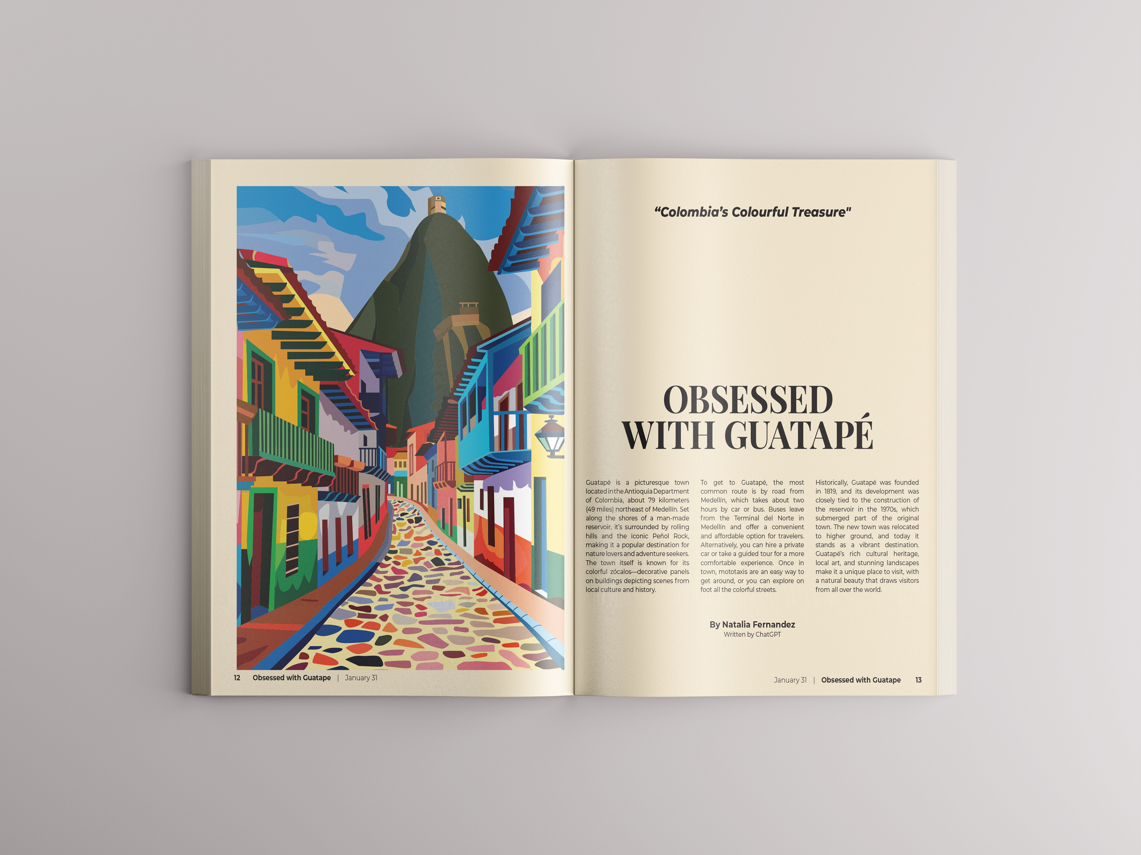
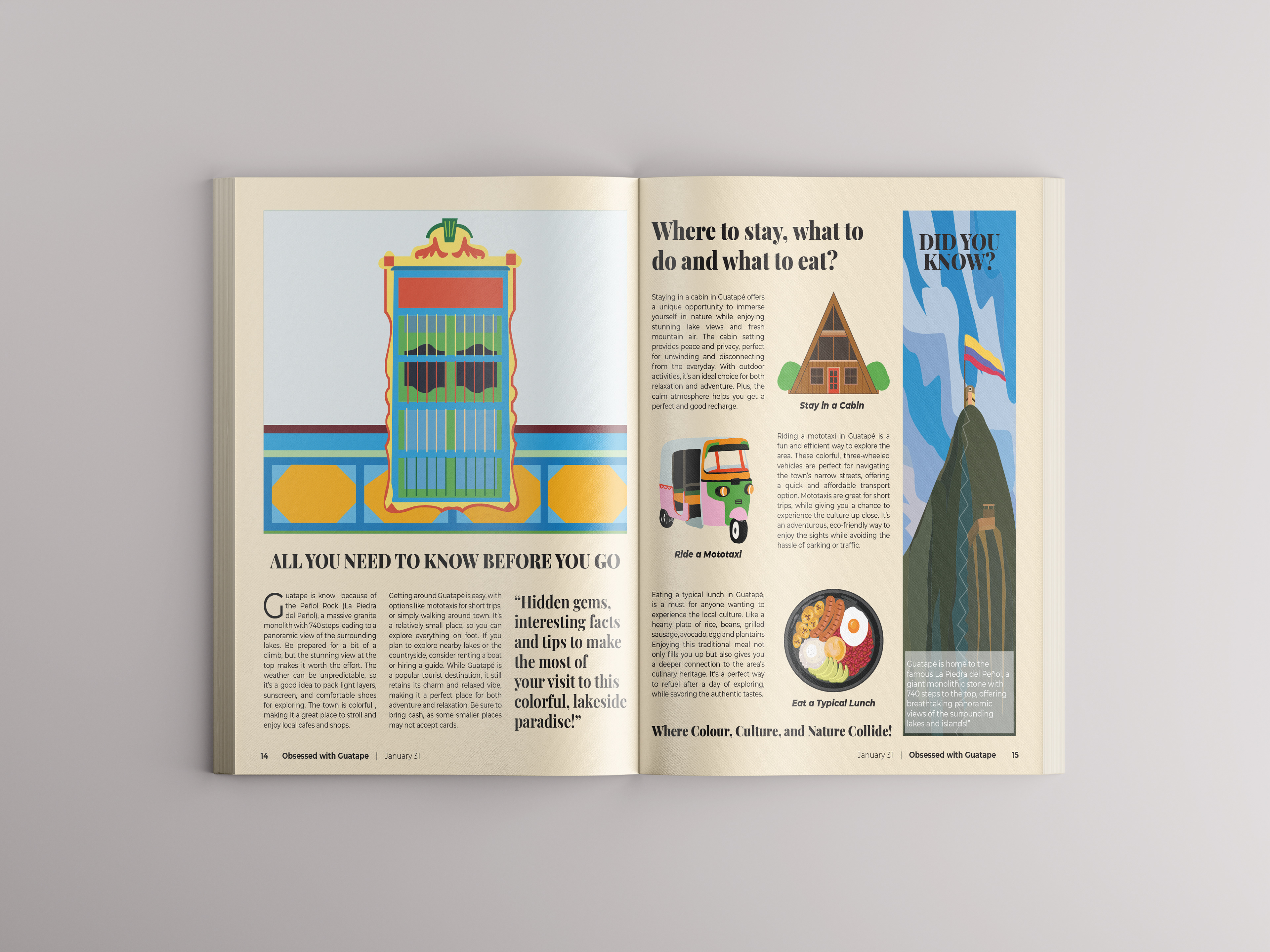
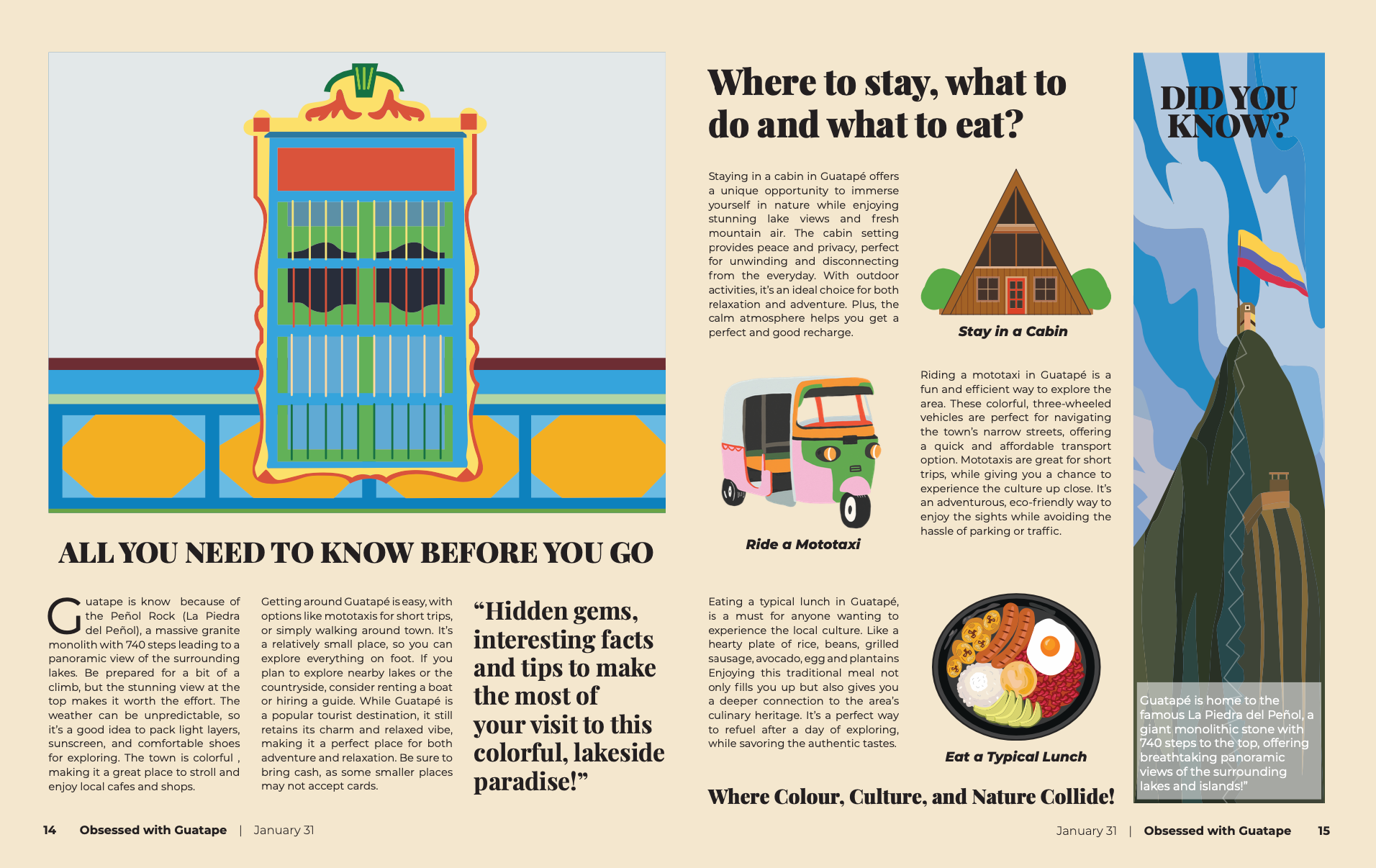
I focused on simplified shapes, bold color blocking, and clean vector style forms to maintain clarity while preserving the town’s richness and charm.
Typography played a key role in readability and engagement and structured columns to guide the reader’s eye naturally across the spread. Hierarchy was carefully considered to create rhythm alternating between dense informational sections and visually lighter areas to maintain flow.

The result is a magazine layout that blends storytelling, illustration, and editorial design principles into a cohesive, inviting travel feature that feels both playful and professionally structured.